
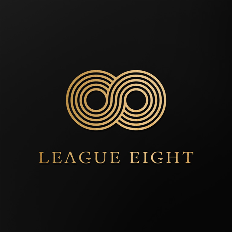
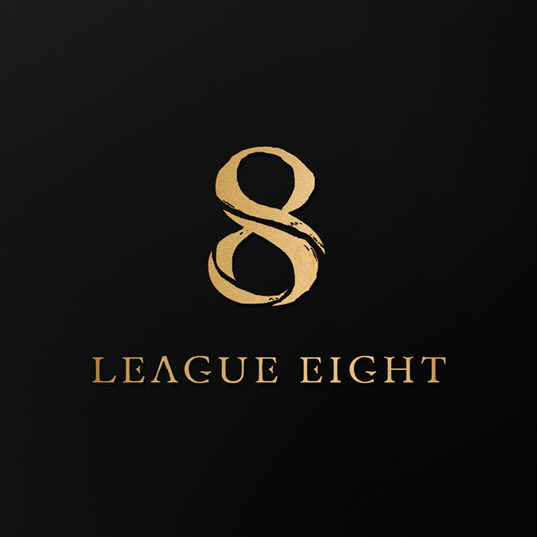
I designed this logo for an up-and-coming new company entitled “League Eight”. I was particularly interested in working visually with the number eight due to its symbolism that relates to infinity, and life & death. My client was clear from the start that they wanted a sleek and simple logo design. I proceeded to draft up concepts in my notebook, and then prepared these three initial concepts to get feedback from the client: (click for a closeup)
Client Profile: League Eight
Company Logo Design


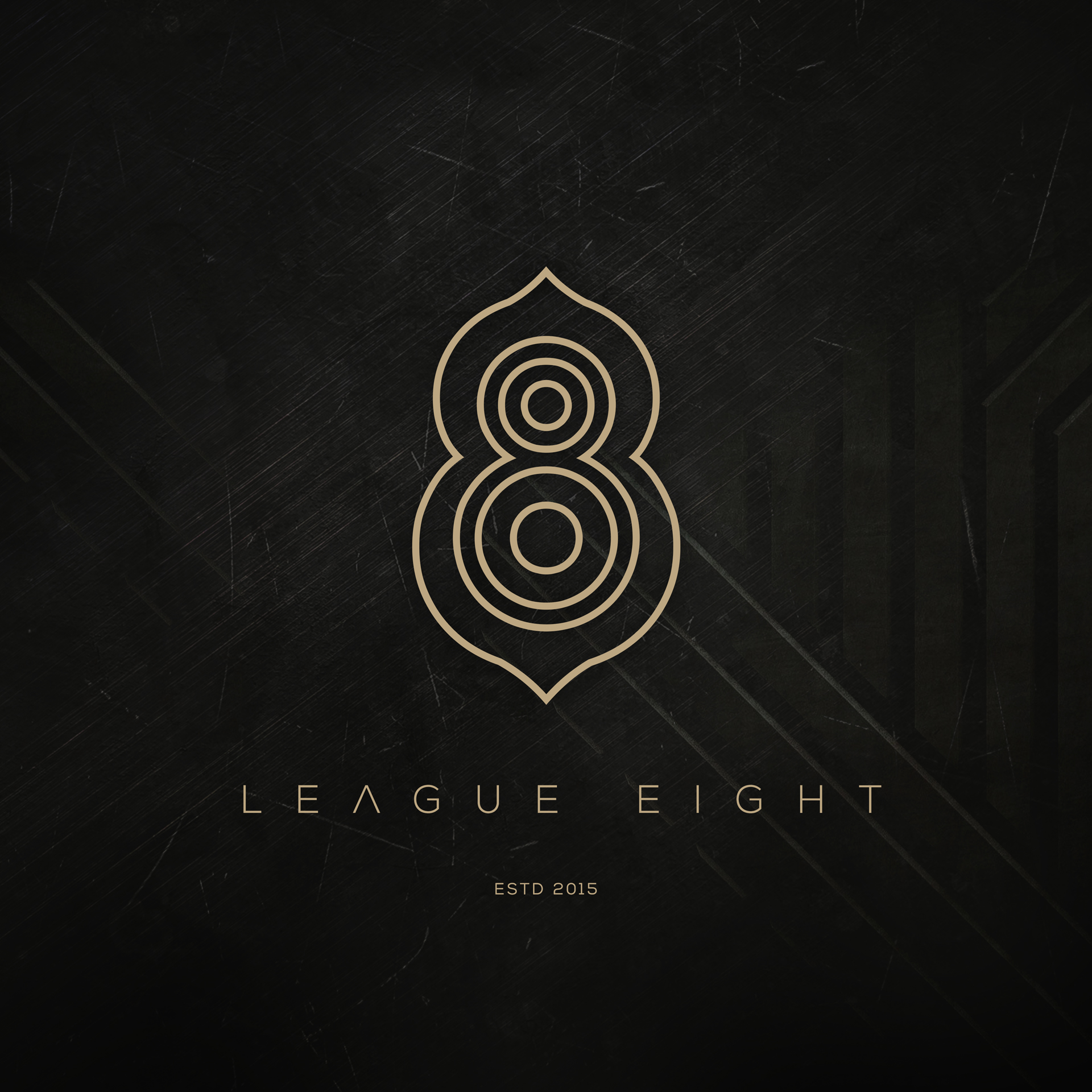
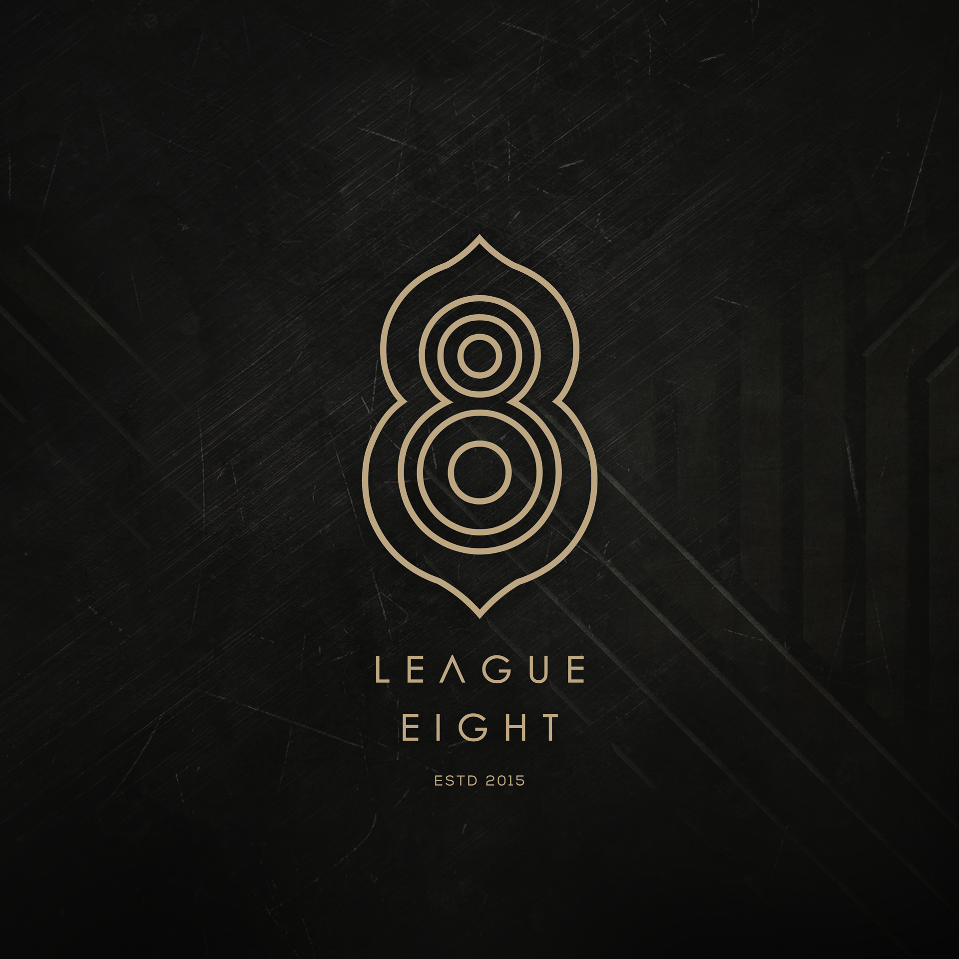
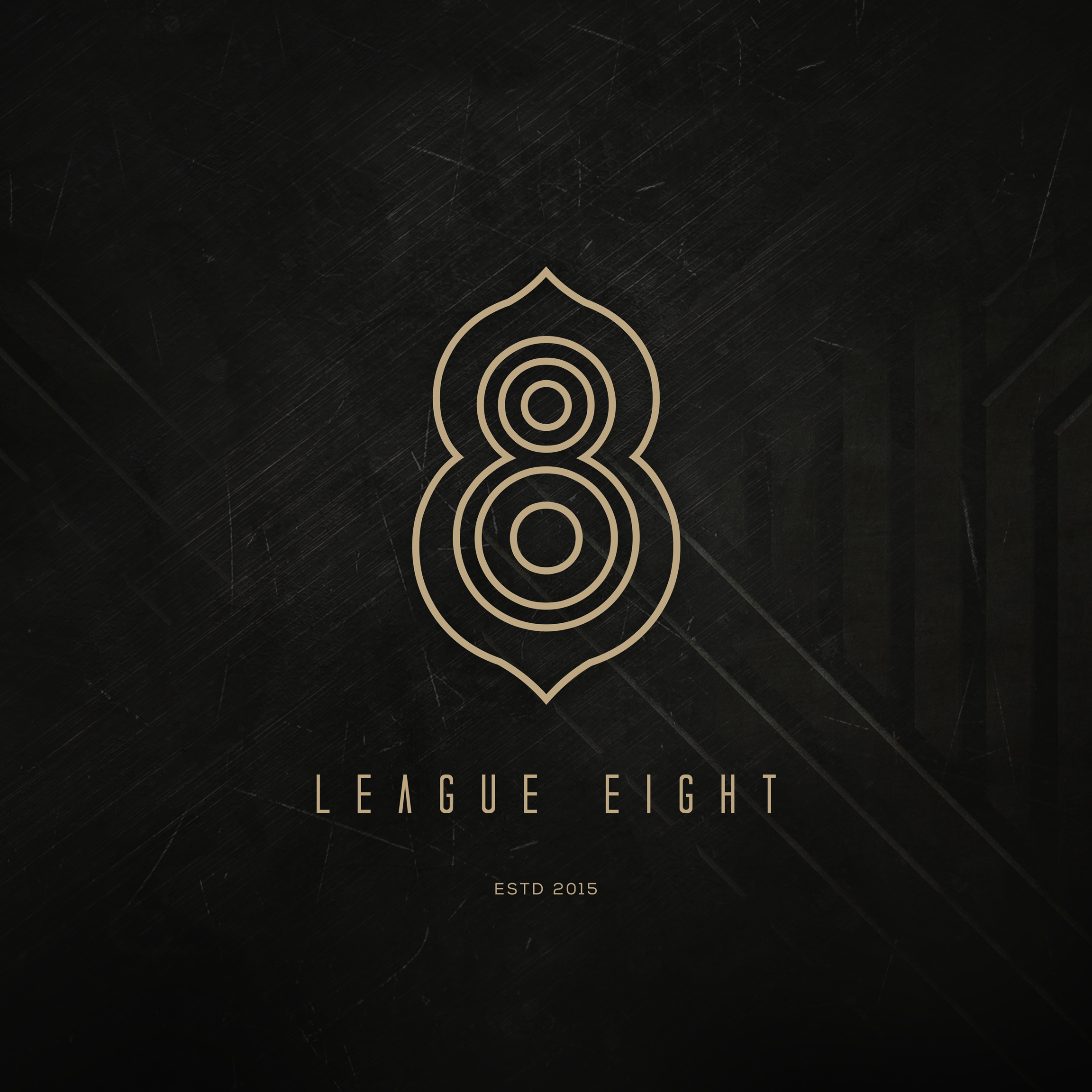
My client was most drawn to the middle logo, but asked if I could change it up a little. I proceeded to add a small point at the top and bottom of the outer rings of the eight. He particularly liked the points, finding them reminiscent of a flower petal. Next came a request for “Estd 2015” in small type under the logo, which created a nice typographic contrast. Unsure about the font choice he asked to see the eight in a more modern font, so I prepared four options with varying typography in each. I also decided to desaturate the gold to lessen the contrast, and added a slightly weathered background with strong cement-like lines cast behind a vignette. Here’s how it turned out:


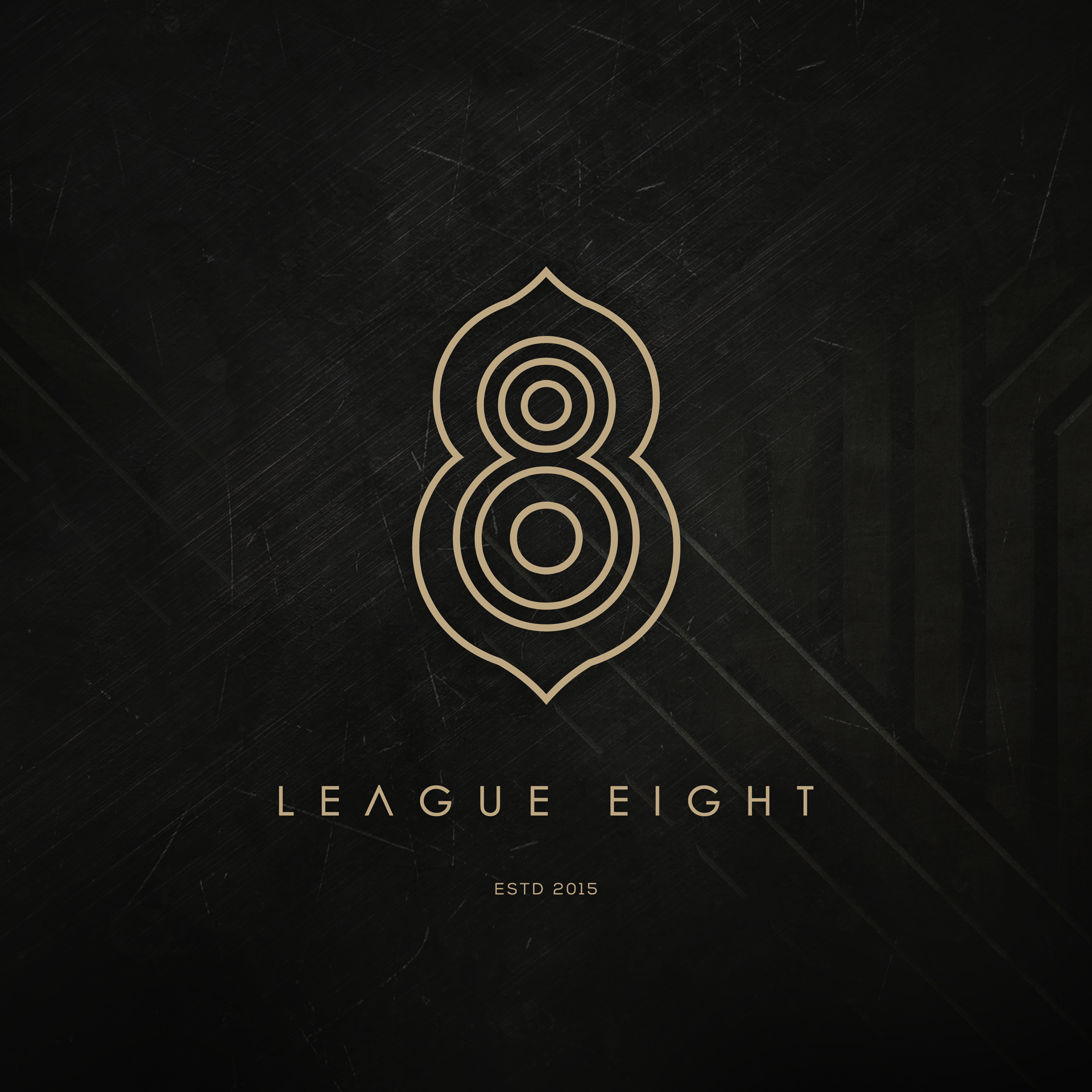
After careful consideration with his colleagues, he realized that he preferred the style of the initial typography. I would have to agree with his opinion. And there you have it: